REREADING KEYS TO DRAWING BY BERT DODSON – WEEK THREE
Week three of rereading Bert’s book Keys to Drawing is over, chapter five, ‘The Illusion of Depth‘, and chapter six, ‘The Illusion of Texture‘ were completed. Topics covered included drawing through, sighting angles, vanishing points, the impact of placing different textures next to each other and loads more, like usual, too many to cover in one post. I’ve decided to cover three ideas that I found extra helpful, but first. Did I manage to stick my arm out and sight at life drawing class, like I said I would last week?
Sadly, no. Not yet, I was at least self aware of it for a good twenty minutes, but I couldn’t quite do it just yet. The voices in my head stopped me :( Next week we’re having a random week of drawing a winter scene, so the next chance to practice sighting will be the week after when we have a tutored life drawing session with Ian Barlow :)
It’s funny, because I mentioned to Lee, who I was sat next to, about needing to measure more and he said he too doesn’t sight enough either. It sparked off an interesting discussion, where a couple of the ladies said you have to sight when drawing the human body! I don’t know if it was because I was so aware of it, but everyone seemed to be sighting this week lol I saw arms being extended around the room all evening, as if the Universe was saying, look, they can do it … So can you. I intend to meditate on it and visualise myself doing it, hopefully I’ll do it next time. I was however more aware of my measurements, taking my time to study the model before drawing and checking my alignments. So I did implement some of the things I learnt last week :)
Enough about that, this weeks drawing exercises saw me going outside (oh my god, I went outside lol) to draw the local co-op superstore in two point perspective, my jumper draped over the back of a chair and various textures such as leafs and hair. My two favourite exercises however, were as follows:

INTENSIFYING WITH DEPTH PRINCIPLES
The Intensifying with Depth Principles exercise has you setup a still life, with the emphasis being to apply the four depth principles (see below). I decided to place one of my high heels at the front, with my little piggybank on top of a manga book in the background, and some of my business cards in the middle. I loved drawing the heels, I’d like to have taken it a bit darker, but I still feel it has the illusion of being in front of the other items.
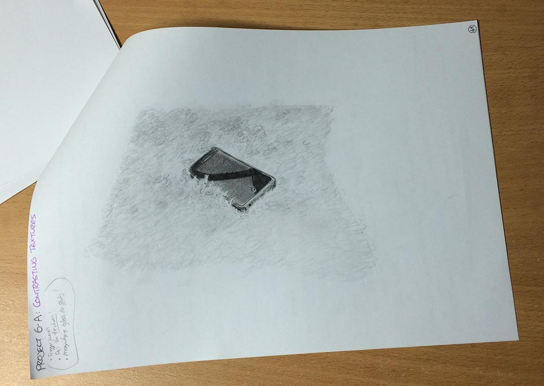
CONTRASTING TEXTURES
The Contrasting Textures exercise turned out to be a lot of fun, just because it was so different to what I normally do. You had to place two different textures next to each other, to highlight how this will make each texture appear more textury :) I placed my phone on top of a fluffy cushion, and used Berts shape and scribble technique. I feel it has the beginnings of looking soft and fluffy. I also like how the phone appears to be pushing into the cushion :)
“FOR GOD’S SAKE OVERLAP!”
– One of the Hosts from the DrawnToday Podcast
One of the main takeaways from the illusion of Depth chapter, was the four depth principles. These are simple things to understand, but super powerful for adding depth to a drawing. I would imagine these will be especially helpful to remember when creating characters, and scenes from your imagination.
THE FOUR DEPTH PRINCIPLES
Overlapping shapes
“When two shapes overlap, the eye perceives one as being behind the other, thus creating a third dimension.”
Diminishing sizes
“Same-size objects which recede into the distance appear to get smaller. Even objects of irregular size, such as clouds, are better able to suggest depth if those nearer the horizon are drawn smaller.”
Converging lines
“Sets of parallel lines like railroad tracks, will appear to converge as they meet the horizon. This phenomenon is the basis for linear perspective.”
Softening edges and contrast
“As objects become more distant, the intervening atmosphere will soften edges and lessen contrasts. This is sometimes called aerial perspective.”
I think it’s worthwhile getting these principles in our head so we know them without even thinking about it. That way, we can start to introduce them into our art, even when it doesn’t exist. Exaggerating, for instance, the size of a person in the background, to create even more depth.
“THERE ARE NO SHORTCUTS. TO MAKE A GOOD ELLIPSE, YOU WILL HAVE TO DRAW A LOT OF THEM.”
– Bert Dodson
Establish your eye level
The ellipse closes, or flattens, as it nears your eye level.
“REPETITION WITH VARIATION IS A DESIGN PRINCIPLE IN BOTH ART AND IN NATURE.”
– Bert Dodson
The final highlight from this week is a little one based around textures. Bert’s main advice when drawing textures, is to, “Repeat but vary.” Using what he calls both articulated and suggestive styles. Articulated is where you draw the texture highly detailed and slowly, whereas suggestive is much looser and more of a scribble.
In fact, Bert has a method called Shape and Scribble, where you draw your overall shapes first, than look at the texture and just do a scribble. Keep scribbling while looking at the subject, and soon you’ll find a scribble that mimics the pattern of the texture. Sounds like fun, and it is :)
So that was week three! Next week will be the last, covering the final two chapters, “Pattern and Design“, I believe that one’s composition and finally “Drawing and Imagination“, which is drawing from your imagination. Incidentally, Bert Dodson has another book called, ‘Keys to Drawing from your Imagination.’ I actually bought it in 2013, right after finishing this book the first time, but I’ve honestly never even looked in it. Mainly because I wanted to focus on just learning basic principles of drawing before trying to start making up my own stuff, but as I intend to start creating my own characters this year, maybe now is a good time to start reading it! Hmm, *chin rub* :)
REPETITION WITH VARIATION IS A DESIGN PRINCIPLE IN BOTH ART AND IN NATURE
– Bert Dodson